Multi-channel
smart templates
at scale.
Company
CHILI publish
Role
UX Specialist
Timeline
2020 - present
01
Summary
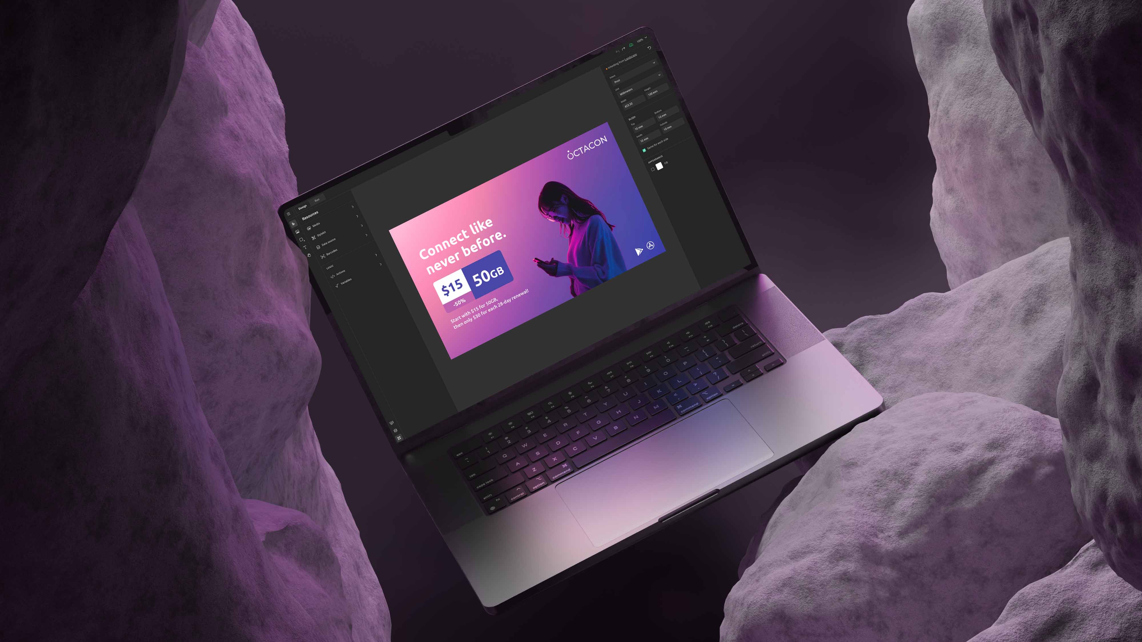
GraFx Studio revolutionizes template design with an intuitive interface and AI assistance for configuring complex business logic into templates. Integrated with DAM, font repositories, and data sources, it enables on-brand designs at scale.
02
Research
2.1 How does our legacy product work?
During my first weeks at the company, I learned the ins and outs of our existing product while asking a lot of questions to get a deep enough understanding of the current situation and company structure.
2.2 What do our internal people say?
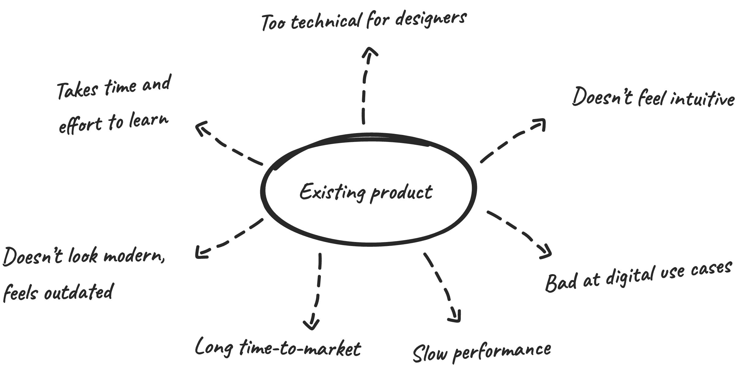
I started talking with our internal client success and sales teams who already had years of experience with our customers and products to learn more about the history of the product and the most common challenges.
2.3 What do our actual users say?
We organized multiple sessions with our existing customers and their users to better understand their specific use cases and the problems they encounter today. All the outcomes were documented in Confluence and made available to the whole company.
2.4 What does the competition look like?
During the entire process, I dove into the products of our competitors but also into other less related products to see how they tackle certain challenges.
03
Opportunities
3.1 Reducing the learning curve
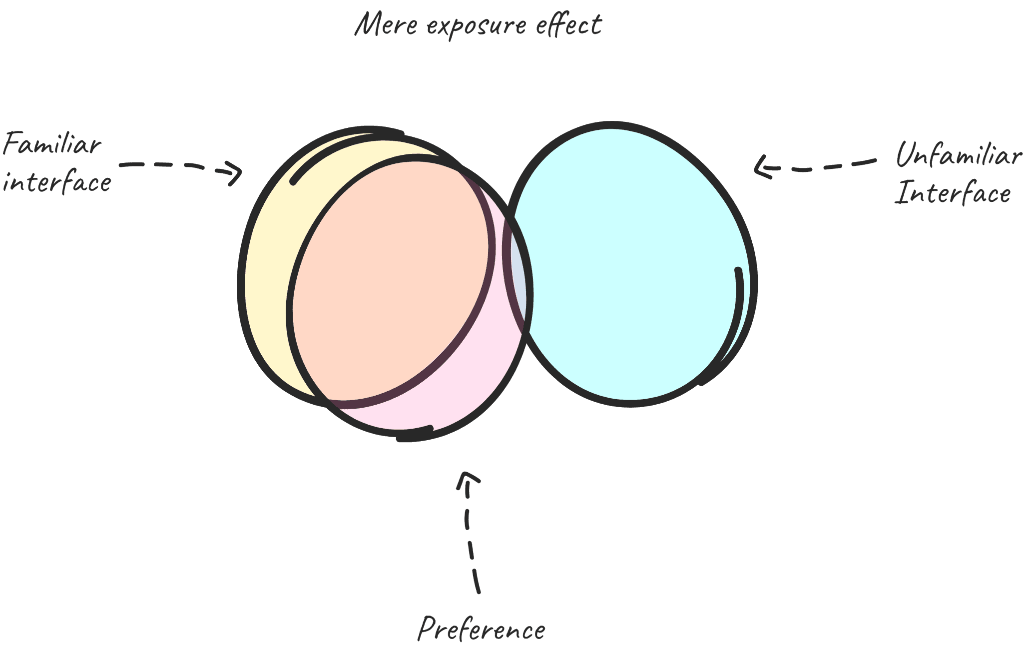
Our users already spend a lot of time learning other well-known design tools in the industry, so creating an environment with a familiar interface, recognizable design patterns, and well-known keyboard shortcuts was key during the entire process.
The mere exposure effect suggests that users tend to develop a preference for user interfaces they see more often, making familiarity a key component of effective design.
3.2 Bridging the gap with AI
AI simplifies template creation by reducing coding knowledge and automating manual tasks, making the process faster and more efficient.
3.3 Template creation 45% faster
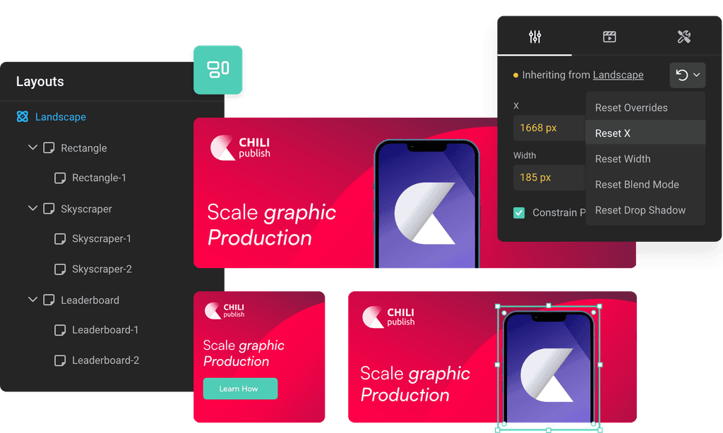
Customers claim up to 45% faster template creation compared to the legacy solution. Fast and efficient template creation is crucial, so we rethought our core automation features from scratch, introducing innovative ways to automate the process further.
To streamline the creation of multiple sizes, we introduced a layout inheritance model. Changes made to parent layouts automatically update child layouts, with options for manual overrides, enabling even greater flexibility and efficiency.
3.4 Scalable design with variable data
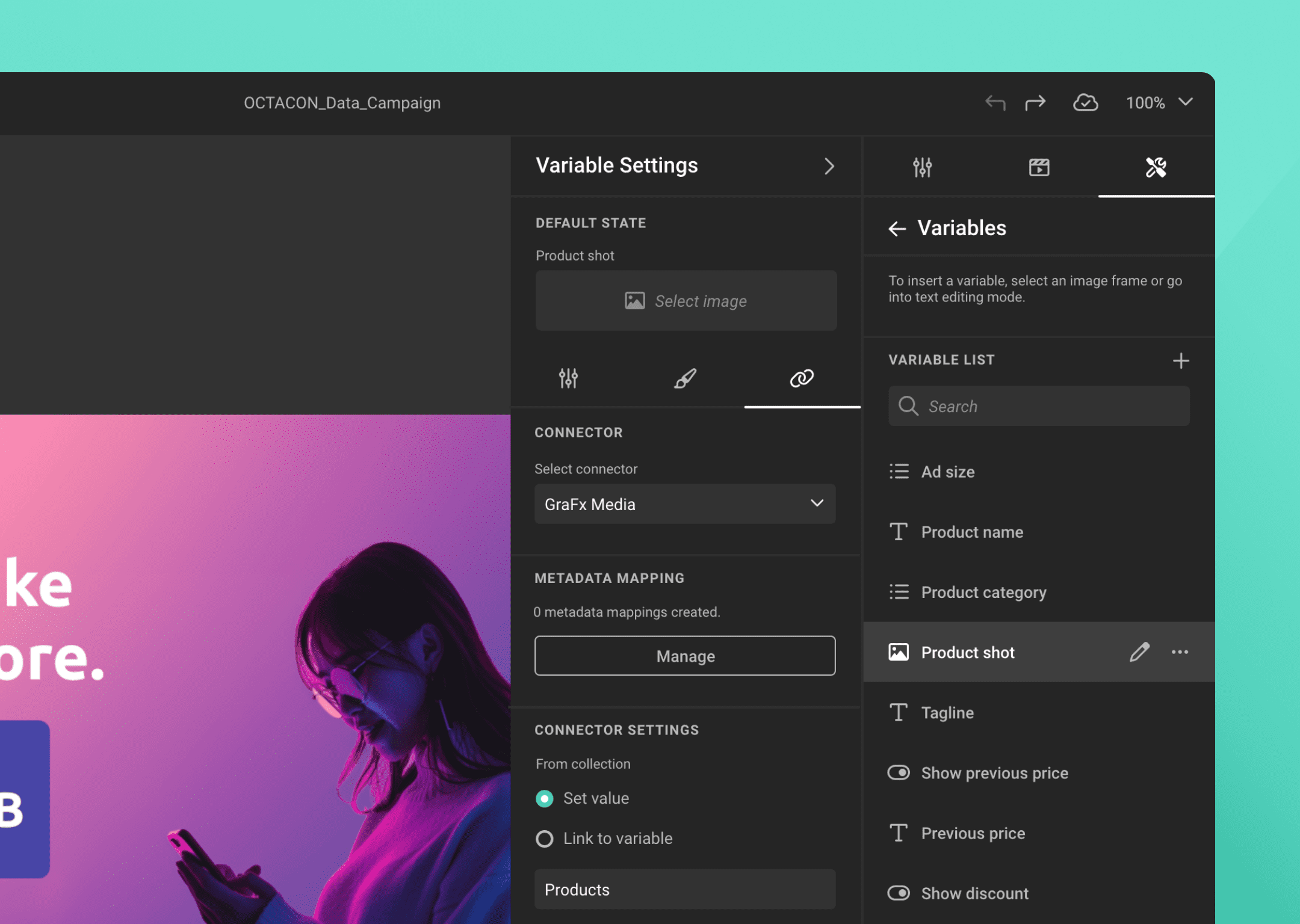
Text, images, colors, etc can be made variable. Those variables can be accessed by end-users through a minimalist form-based workspace or utilized within a data source approach for creating endless variants.
3.5 Multi-channel workspace
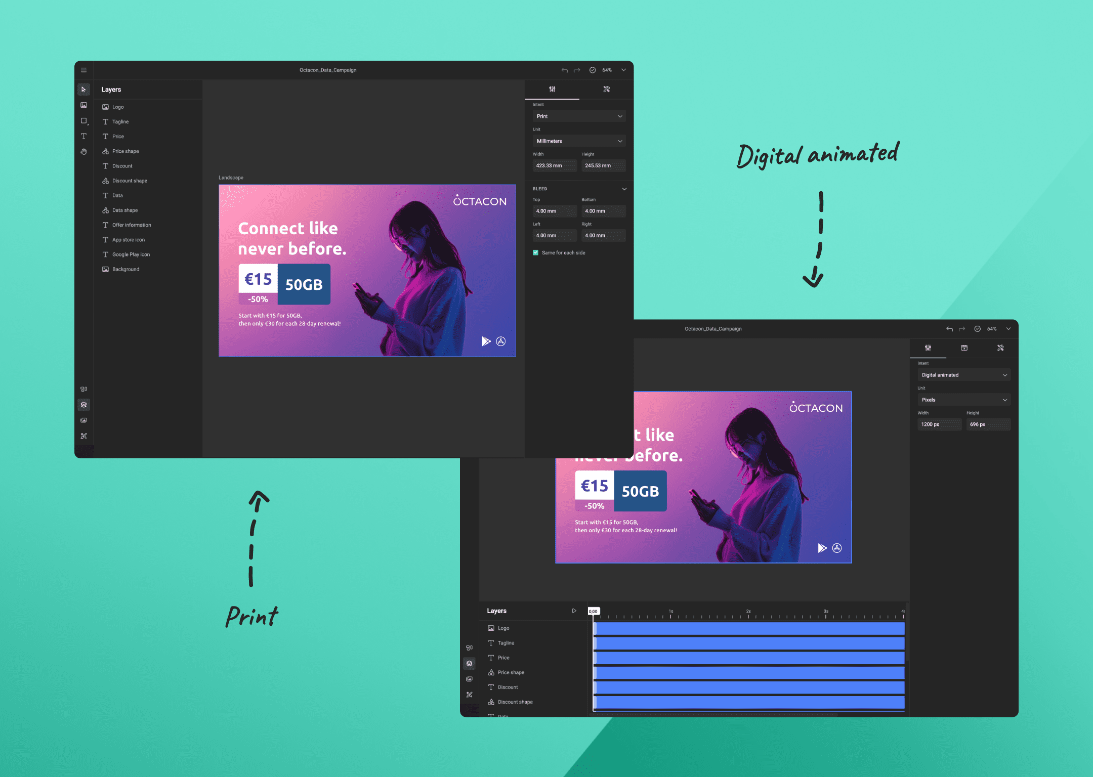
Template Designers can now design for various output channels within a single template. The workspace adapts based on the selected layout intent, displaying only relevant components for a seamless user experience.
04
4.1 Accelerated Time-to-Market
The modern tech stack enables CHILI publish to roll out new features and product updates faster than before, enhancing competitiveness and keeping pace with evolving customer needs.
4.2 Reduction in training costs
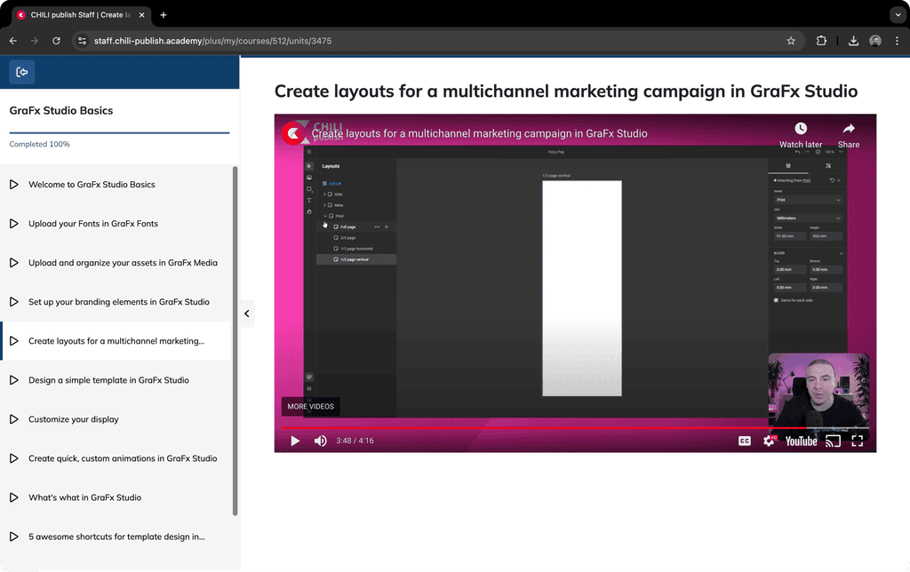
The old editor's unfamiliar interface made onboarding slow and costly. With the new user experience, better documentation and an LMS, learning is faster, reducing training time and expenses.
4.3 Competitive advantage
A single multi-channel smart template editor with advanced automation features sets us apart from the competition positioning us as a leader in the industry enabling a broader range of potential customers.
4.4 Lower maintenance costs
Building a new solution from scratch demands substantial financial and human resources. However, in the long term, a modern tech stack will reduce maintenance costs and significantly boosts performance compared to outdated systems.
05
5.1 Enhanced experience
By creating a more familiar environment, Template Designers now spend less time learning and enjoy a smoother experience, resulting in higher customer satisfaction.
5.2 Faster to market
The out-of-the-box solution in combination with the newly documented SDK enables customers and partners a much faster go-to-market time.
5.3 Increased performance
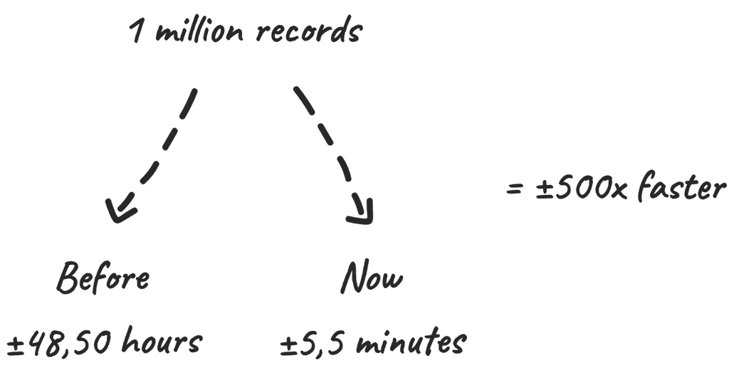
The new tech stack results in huge performance improvements, in the editor but also the output.
5.4 Broader use cases
Next to print use cases, our customers can now also enable multiple digital use cases without the need to switch between multiple editors.
5.5 Increased efficiency
Our smart template building solution significantly cuts costs by saving time and eliminating repetitive tasks.
06
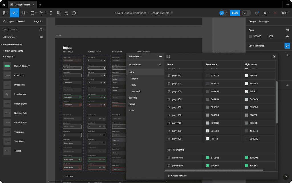
As the only designer in this project, a design system based on Adobe Spectrum was created by me establishing principles and components to ensure consistency and familiarity while providing developers with accessible design assets.
6.1 Design tokens
I knew this project was going to grow over the upcoming years and that this system had to be maintained in an effective way. The most important properties were tokenized in Figma and can be adapted at scale at any time during the process.
6.2 Re-usable components
Components were created with different states and variables to switch between scaling/theming/etc… This allowed me to make changes to one component and see them reflected in hundreds of mockups with minimal effort.
07
Process
Although I consider myself a perfectionist, I also believe that there is no “perfect” process. Working as the sole designer in a large scale-up where things are shipping fast isn’t always perfect. I found myself not always following each step of the "design process", adapting myself to the business goals.
08
Validation
Prototypes underwent validation to refine each feature, with iterations informed by feedback. Due to the rapid transition from design to development, iterative improvements were made based on insights gathered during this phase.
8.1 Feedback sessions
Internal and external feedback sessions were held regularly, involving both team members and daily users of our product. This feedback drove continuous improvements and helped refine the design with real-world insights.
8.2 Iteration examples
Below are some examples of how feedback led to iterative changes in the design, showcasing the progression from initial concepts to refined solutions.
8.3 Next steps
While feedback sessions are valuable in quickly iterating on the design in a fast paced environment, further in-depth user testing will be required to validate its effectiveness.
09
Development
Close collaboration with an international team of front-end and back-end engineers ensured seamless implementation of designs delivered through Zeplin. Daily communication facilitated iterative testing and refinement of the implementations, ensuring alignment between design and development.
"Zeplin bridges the gap between UX and frontend, helping us ship high-quality user experiences faster and more confidently."
Brian Roels, Chapter Lead JavaScript
10
Conclusion
As the sole designer on this project, I take pride in the progress we've made and the accomplishments of GraFx Studio. While our product has reached an impressive stage, there's always room for enhancement, particularly in refining the research and validation processes. Let's continue our journey of learning and improvement, ensuring GraFx Studio remains at the forefront of innovation in the Creative Automation industry.
