The future of
creative automation.
Company
CHILI publish
Role
UX Specialist
Timeline
2020 - present
01
Summary
CHILI GraFx is a creative automation platform for scalable graphics production, with a smart template builder and a unique connector framework. It automates repetitive tasks, ensures brand consistency, and enhances workflows for efficient, large-scale graphics production.
02
Research
2.1 What’s the short and long-term vision?
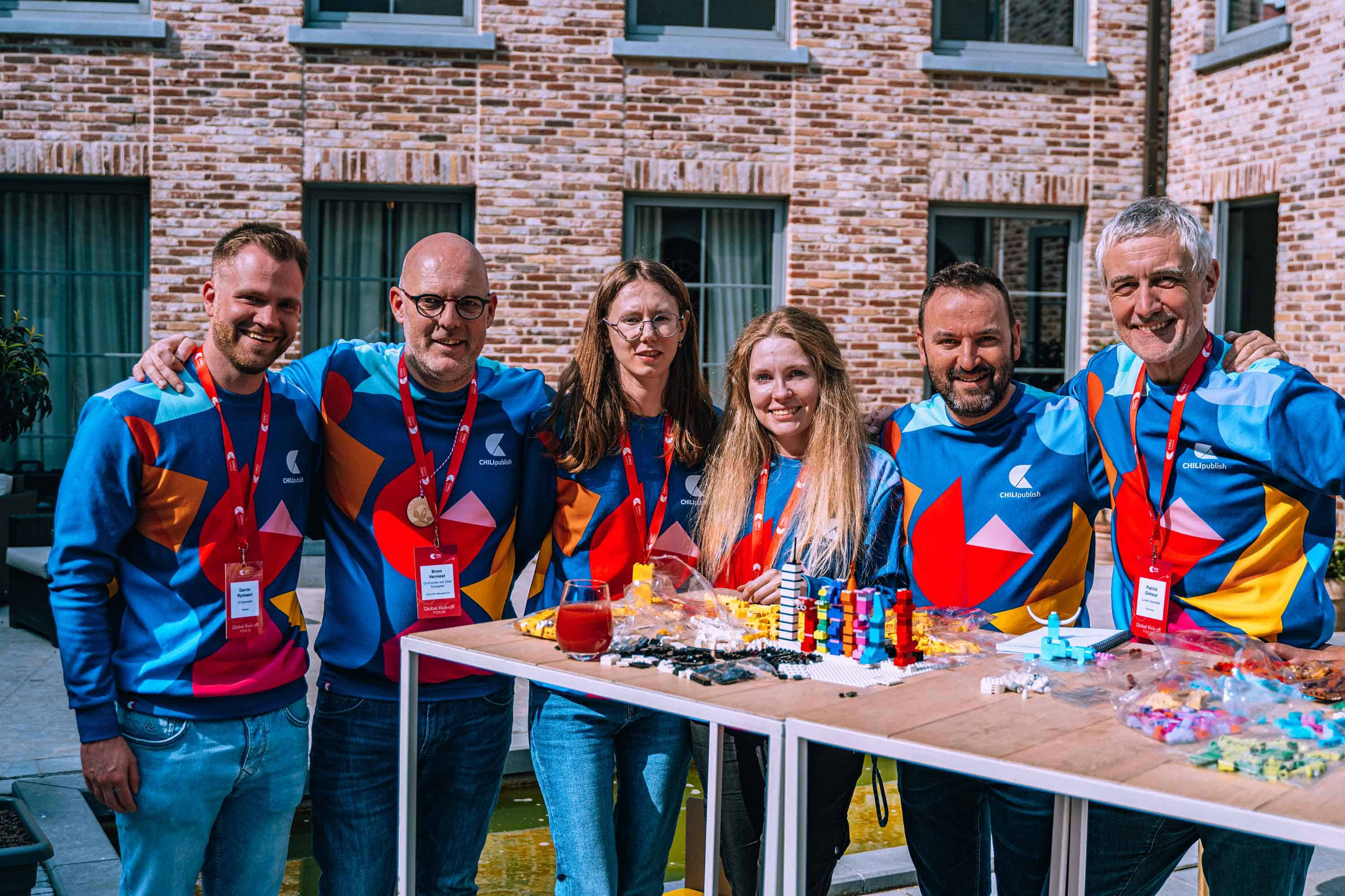
I focused on understanding the short- and long-term vision early on. Within the product team, we had regular alignment sessions with each other and key stakeholders. The company also did a great job refining and sharing the overall vision through company-wide sessions and kick-off weeks, bringing in colleagues from around the world.
2.2 What challenges are we solving?
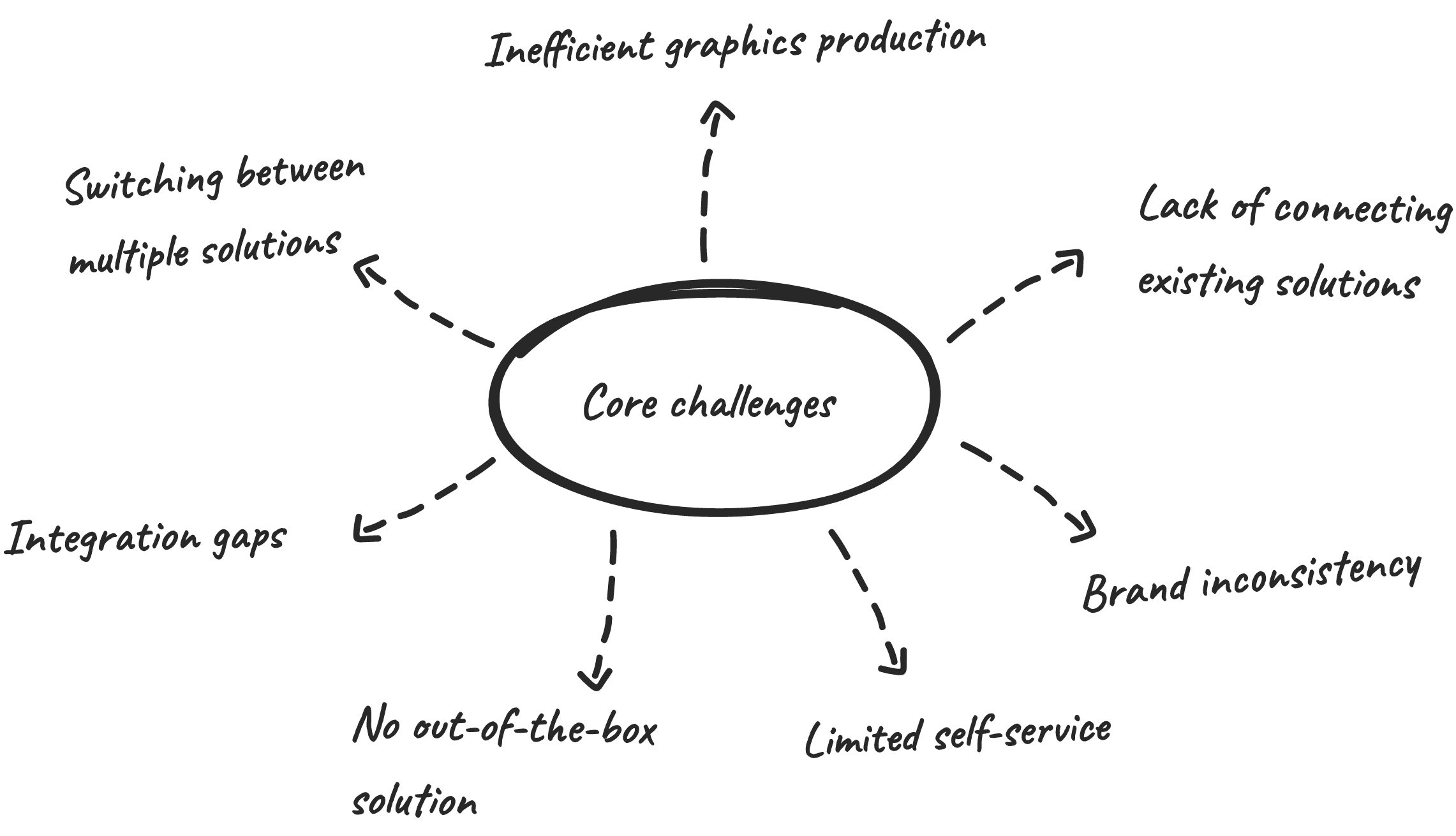
I've learned that we're solving the challenges of large organizations struggling to manage creative assets across multiple tools. Our platform centralizes assets, scales multi-channel production, enables self-service, and maintains brand consistency, with a connector framework for seamless integration.
2.3 Who are our users?
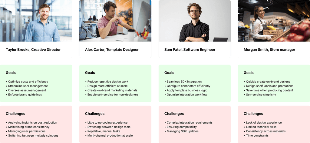
I also learned that our customers have a diverse range of users: admins managing, designers creating templates, technical users setting up connectors and defining logic, and end-users self-servicing templates. The user personas below are based on real user insights, the portraits are fictional.
2.4 How do other solutions compare?
While building our applications and connector framework, I explored systems like other DAMs, font repositories, and smart template builders to see how they work. I documented key insights in Confluence and shared them with the team.
03
Information
architecture
Before diving into the design, it was important to define the platform's structure. At the core is the subscription level, where admins manage users, environments, connectors, and integrations.
Each subscription can have multiple environments, each with its own applications and connectors. These environments handle creative operations managing assets, maintaining brand consistency, and scaling graphics production.
04
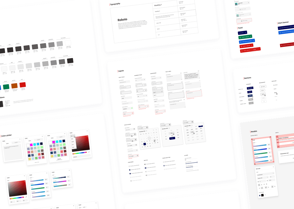
We created a design system for the platform alongside GraFx Studio's. While GraFx Studio uses desktop scaling with light and dark themes, the platform's system focuses on mobile scaling for a seamless experience on both mobile and desktop, ensuring design consistency and smooth developer hand-off.
05
Design patterns
5.1 The importance of familiarity
With multiple applications, users interact with many features. To simplify this, we applied Jakob's Law by introducing familiar design patterns. This means consistent interfaces for browsing Templates, Media, and Fonts. On the admin side, we reused table-based patterns for managing data, ensuring a consistent experience.
5.2 Reducing development time
Reusing familiar patterns and components significantly reduced development time, allowing us to bring features to market faster while maintaining consistency and quality.
5.3 Improved load time perception
We added loading skeletons in all the applications to mimic content while it’s loading. This keeps our users engaged and makes the interface feel faster by replacing traditional spinners with placeholders that resemble the final layout.
06
Core features
6.1 Subscription management
At the subscription level, admins can gain insights, manage their subscription, assign user roles and groups, and oversee environments, connectors, integrations, and much more.
6.2 GraFx Studio
At the heart of the platform is GraFx Studio, a smart template builder designed to create data-driven graphics at scale and enable self-service templates.
6.3 GraFx Media
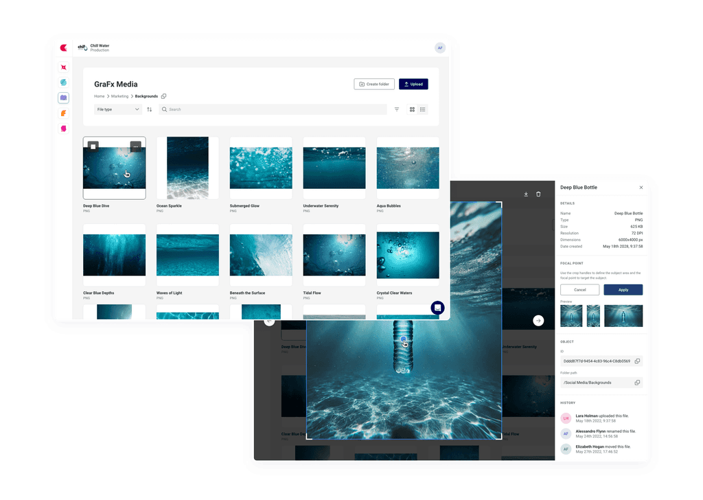
GraFx Media allows customers to upload and organize creative assets within the platform, or seamlessly replace it with their asset repository through our connector framework.
6.4 GraFx Fonts
GraFx Fonts enables customers to manage their font families within the platform. Fonts can be linked to Stylekits, ensuring that templates consistently use the correct fonts across all templates.
6.5 GraFx Stylekits
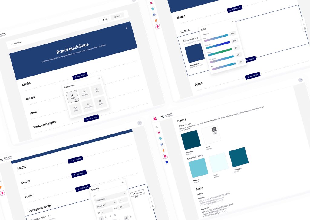
GraFx Stylekits is where brand protection happens. Customers can define their brand guidelines, including colors, text styles, and fonts. Stylekits can be used within the smart template builder to ensure designers create on-brand templates.
07
Collaborative feedback
I collaborated closely with internal stakeholders and front- and back-end teams through meetings and feedback channels to ensure continuous communication. Input from internal feedback, customer sessions, and Jira requests drove ongoing design improvements.
08
Customer impact
8.1 Flexibility
The connector framework lets customers replace native GraFx applications by building their own connectors or using one of ours inside a single platform.
8.2 Scalability
The platform grows with the customer, allowing them to scale multi-channel content production efficiently by adding more environments, output renders, storage, and more as needed.
8.3 Time savings
By automating repetitive tasks and offering self-service, the platform significantly reduces the time needed for creative production.
8.4 Data-driven insights
Customers gain valuable insights from platform insights, helping them make informed decisions and optimize creative strategies.
8.5 User empowerment
Non-technical users can easily modify designs using self-service templates, reducing dependency on specialized roles.
09
Engagement
Initially, we lacked a way to communicate with users through the platform. After me and my team explored different solutions, we chose Intercom for its long-term potential. Today, it’s widely used by our teams to onboard users, notify them of new features, collect feedback, and more.
10
Conclusion
Designing a platform for a wide variety of users has been an ongoing challenge, but I believe we took the right approach. We incorporated familiar, scalable design patterns and adapted the experience to different user types simplifying the self-service part by using clearer terms and less advanced components for non-technical users, while maintaining more advanced features for technical profiles.
Although we focused heavily on shipping quickly and aligning with business goals and strategy, there are still areas that need improvement, like mobile behavior. As the platform continues to evolve, addressing these gaps will be key to ensuring a seamless experience across all devices.
