Streamlining
ventilation
inspections.
Company
BCCA vzw
Role
UX/UI Designer
Timeline
2018 - 2020
01
Summary
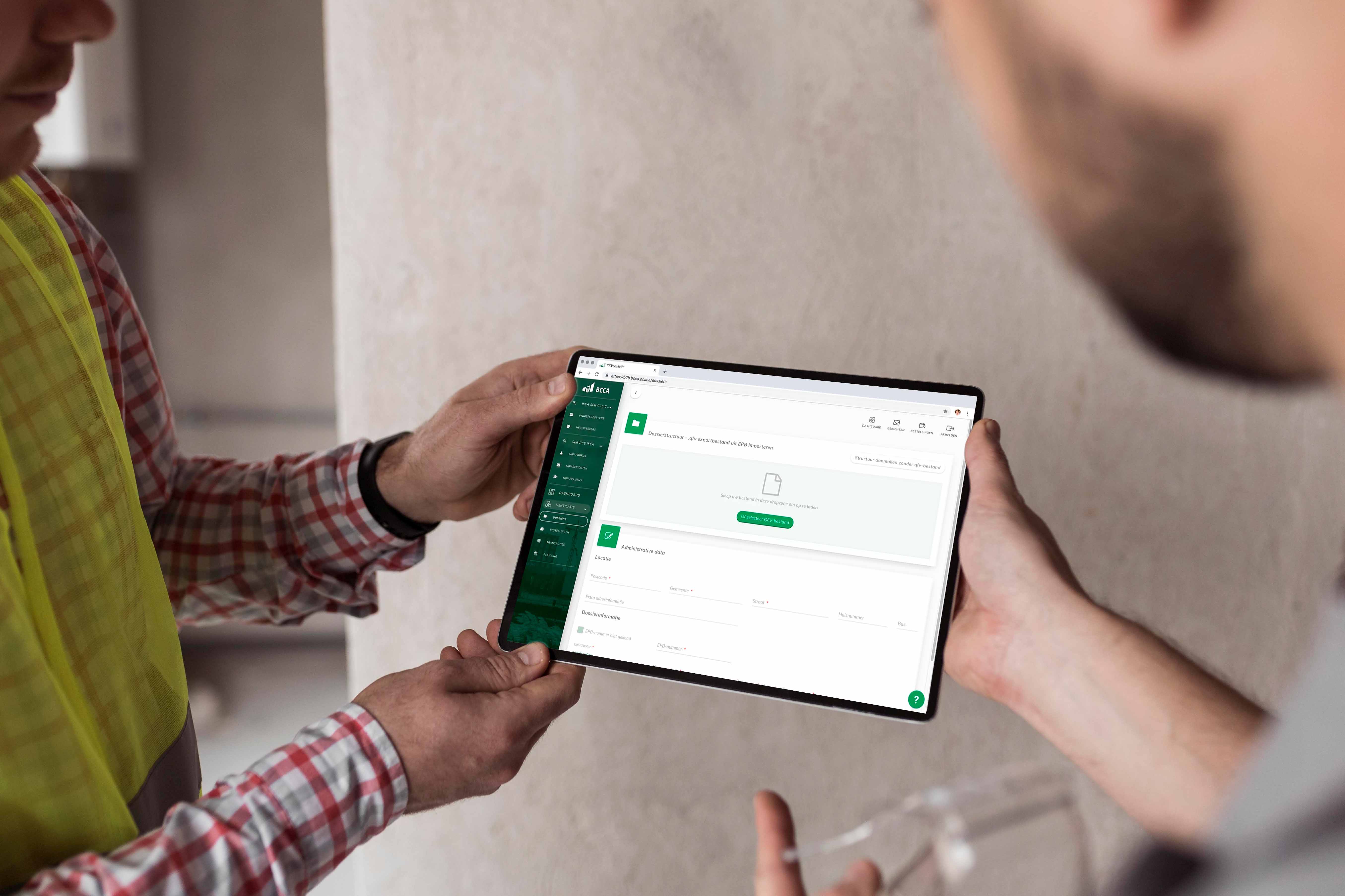
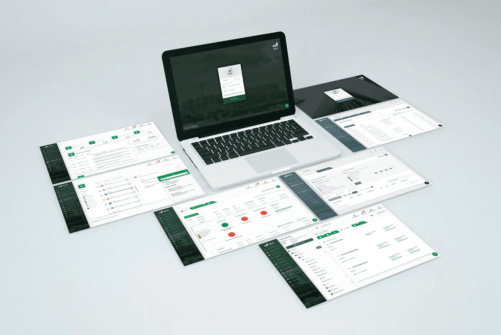
The Belgian Construction Certification Association needed a digital solution to manage administrative data efficiently. Partnering with Hailforge, we developed a B2B platform to streamline their operations.
02
Problem
Challenges in data processing
Creating and validating ventilation reports involved processing large volumes of data, previously managed on paper. This outdated method was time-consuming and cumbersome for both BCCA employees and their business partners.
"We need a solution which allows us to grow with the market easily and adapts to new opportunities as we see them rise. A solution that allows our employees and the employees of our business partners to work remotely and even on the road. And it should be easy to approach!”
B. De Blaere, General Director
03
Approach
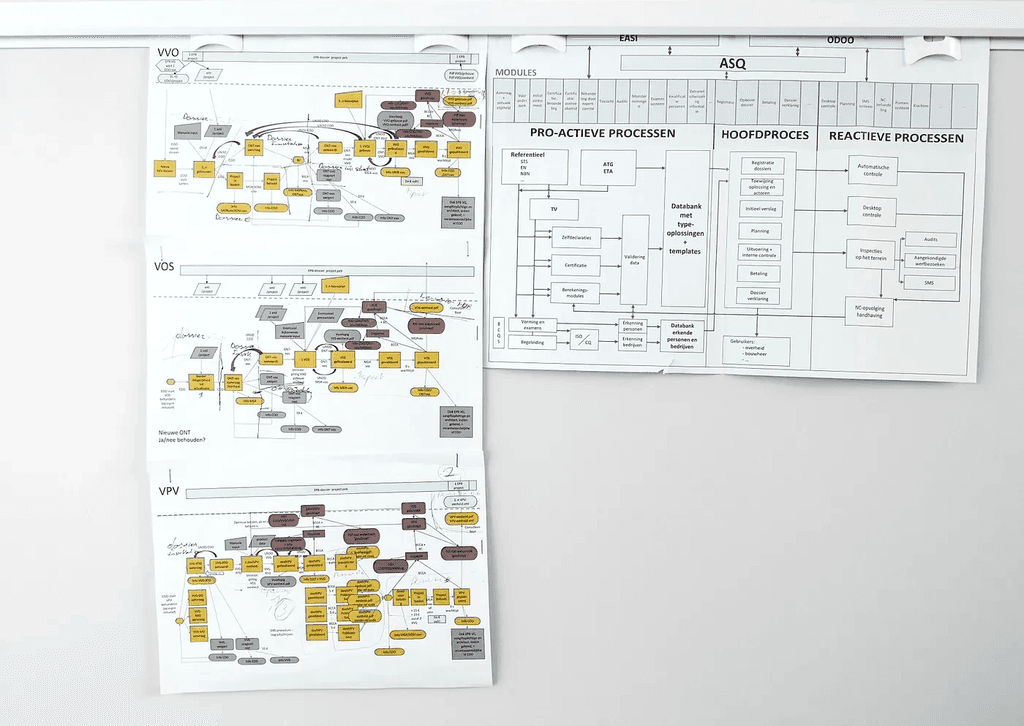
3.1 Understanding complex workflows
Each stage in creating a ventilation report involved different workflows and roles, making the process complex for users. Thoroughly understanding these phases and possibilities was essential before designing the user experience.
“To create, one must first question everything”
Eileen Gray
3.2 Understanding user needs
With limited time and budget, we relied on insights from BCCA engineers to identify user pain points and areas for improvement, focusing on simplifying daily workflows.
04
Design process
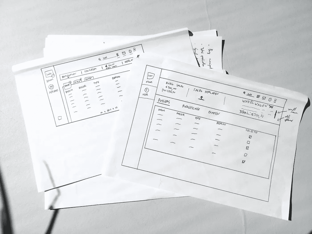
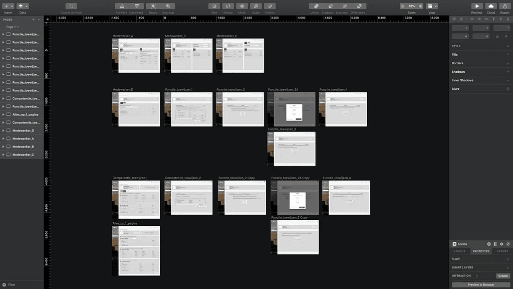
4.1 Wireframing solutions
Starting with rough sketches on paper, we then developed digital wireframes, considering all potential user flows and the final interface design.
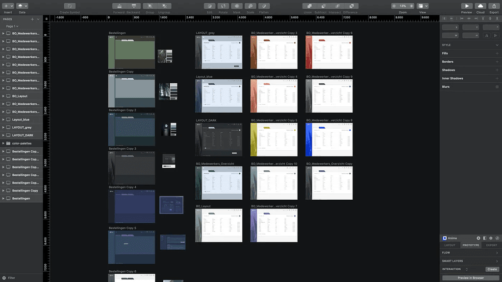
4.2 UI Design evolution
The platform's look and feel evolved over time, reflecting continuous improvements to ensure a polished final product.
4.3 Design system
We created a simple design system to ensure a consistent user experience, aiding front-end developers and future designers.
4.4 Collaborative design reviews
In an Agile setup, I worked closely with developers, discussing design proposals and gathering feedback to align with project deadlines.
4.5 Refining the back office
We tested multiple design options for the back office, using feedback to create an intuitive and visually appealing tool.
4.6 Collapsable sidebars
The platform is used as a work-tool so we implemented collapsible sidebars that when needed can provide more workspace on the screen.
4.7 Tools used
Wireframes and screens were primarily designed in Sketch and shared via Zeplin. Other tools like Adobe XD, Illustrator, and After Effects were also utilized for specific tasks.
05
User onboarding
5.1 Building a knowledge base
We collaborated with BCCA engineers to set up a Jira Service Desk, which houses knowledge base articles. Accessible via a platform widget, users can search by tags to find help or learn about features. The articles include video tutorials, GIFs, and step-by-step written guides to assist users with every aspect of the platform.
5.2 Emphasizing visual content
We launched a public YouTube channel featuring step-by-step video tutorials that cover every aspect of the platform in detail. Created with Adobe Premiere and Audition, these videos are produced in 4K resolution to ensure future-proof quality. Below is an example of a Dutch tutorial on registering a new business account.
These resources help users become familiar with the platform, significantly reducing the number of questions would otherwise be directed to the BCCA helpdesk.
06
Insights
We used Google Analytics and Grafana to track user interactions and identify areas for further improvement, ensuring the platform met user needs.
07
Lessons learned
7.1 Lessons learned
Working on this project was a valuable experience, especially since I had limited user experience design knowledge when I started. I learned a great deal, but if I could do it again, I would focus more on understanding the users and their challenges upfront.
While the tight deadlines constrained the final interface designs, prioritizing user research early on would have led to more refined outcomes. Additionally, incorporating more iterative feedback loops with users throughout the process could have further improved the final product.
7.2 Acknowledgements
• Pieter Van Rolleghem (Software Architect & Managing Partner, Hailforge)
• Peter De Winter (Software Architect & Managing Partner, Hailforge)
• Tobias Van Der Pulst (Full Stack Developer, Hailforge)
• Bram Peirs (Front-End Developer, Hailforge)
• Juliette Van Kampen (UI/UX Designer, Hailforge)
• Liesje Van Gelder (Sector Manager Building Performances, BCCA vzw)
• Maarten De Strycker (Coordinator Ventilation, Airtightless, BCCA vzw)
